The process that took Mo from a figment to a figure was about 5 weeks in the making, but refining his appearance lasted through the summer and into the fall. If I really think back to recapture the process, development of this strange iguana continued right up to press time!
So what elements make up a good children's character?
First, there should be something memorable to the character. Kermit the Frog's odd, crossed pupils and neck frill; the long, tendril fingers of the Grinch; Frog and Toad's anthropomorphic wardrobe. Something else these characters have in common? They're all green! Seems Mo's foundation runs deeper than I had suspected.
Texture is also a consideration. Max's Wild Things are so rich with detail that they seem real. Beatrix Potter's vignettes are no larger than playing cards, yet they contain whole worlds through her mastery of atmosphere and character texture. Similarly, the wintery animals of Jan Brett's work are practically painted from life. With more detail comes more engagement with the story, giving kids more content to question!
Simplicity is key, as well. This may seem contrary to the need for detail and texture, but simplicity and detail can in fact make great bedfellows. Peter Brown's Mr. Tiger is an excellent example. Even with his brushed accents, occasional speckled marks, and subtle expressions, Mr. Tiger is simple and reproducible. A few blocks of orange. Half-moon paws. Green oval eyes and seven or eight stripes on his back. The figure is complex enough to excite, yet formally basic enough that a kid would have a great time drawing him in her notebook.
So, about that iguana?
STEP ONE | Learn Iguana Anatomy :
Sketchbook Contents | June 2014
STEP TWO | Test Illustration Methods:
Watercolor Tests | June 2014
Watercolor Test | June 2014
Watercolor / Texture / Hardline Tests | June 2014
Pencil Tests | July 2014
Digital Composition Test | June 2014
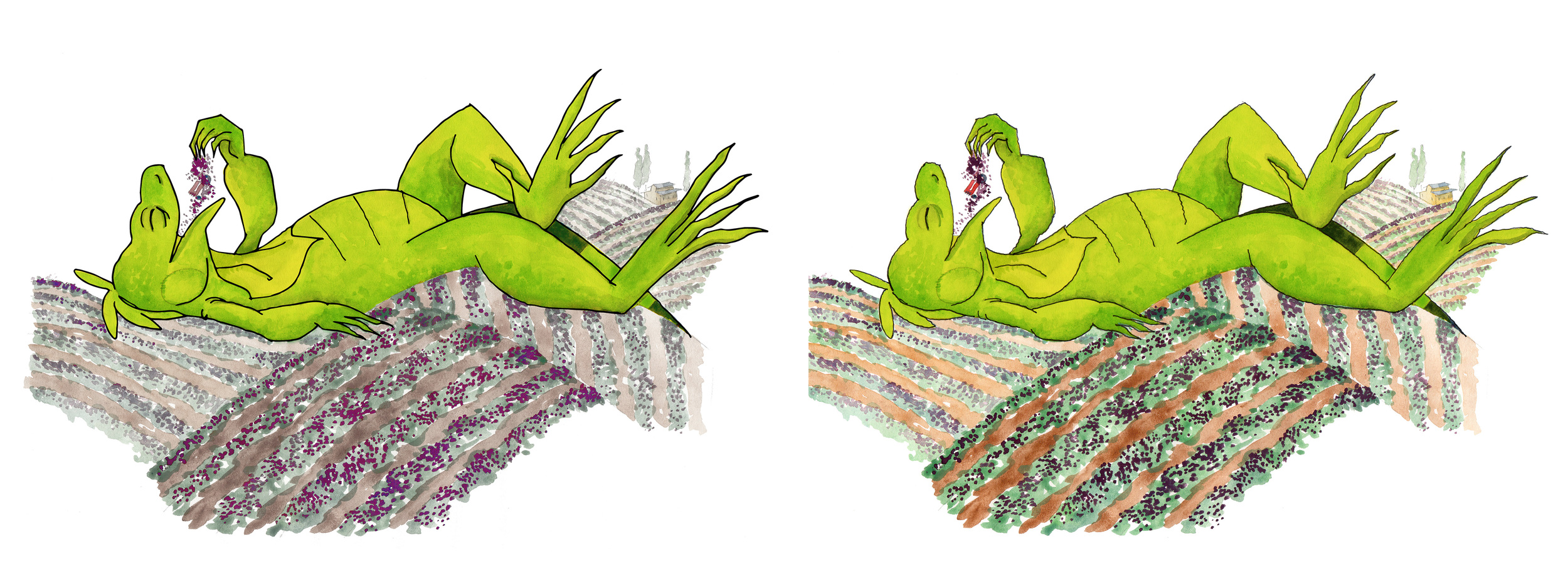
STEP THREE | Make Mo DISTINCTIVE, refined and simpler:
Mo Character | Digital and Watercolor Composite Tests | June 2014
Mo Character | Simplify Tests | July 2014
Mo Character | Head Shape Tests | July 2014
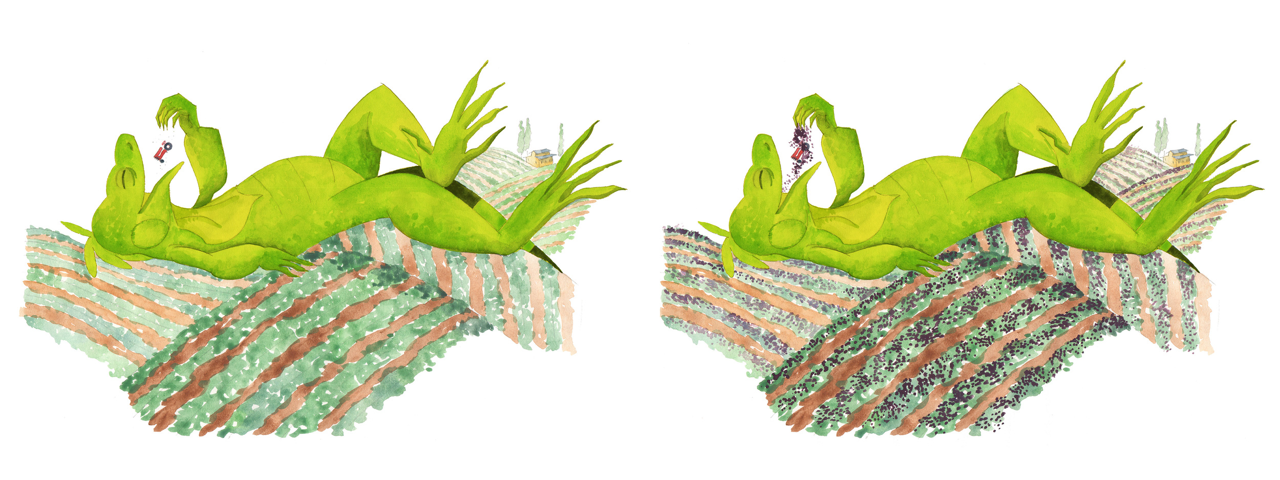
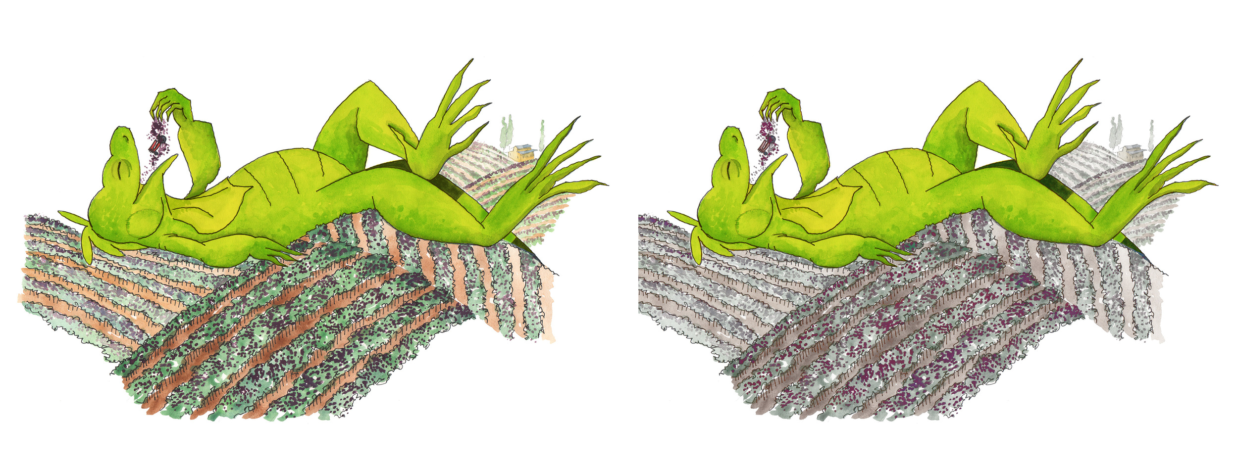
STEP FOUR | Add Texture, Select Colors and VOILA!
Mo Character Features | July-August 2014
Ultimately, friendliness and texture won out over the more biologically-accurate or hard-edged digital versions of Mo. I also learned that I could watercolor Mo just fine, but that my skills fell apart when I attempted to paint complete landscapes (I should have practiced more in art class!!). For Mo's setting, I wanted to achieve solid, rich colors that offered a bold contrast to the organic curves of his shape.
Using this logic and following my gut (!!!), I arrived at the solution for Mo's illustration style, which complements his setting pretty well:
Hand-drawn ink outline + Soft pencil texture + Bold digital coloring
Now that's one stylish lizard!